Last week I wrote about being stuck on repetetive illustrations, but I think I’ve finally gotten myself out of the rut. In fact, I need help narrowing down on an illustration for spread 2 in my picture book. (I want to say this sudden boost of creativity came from the fact that that I worked outside in the sun today, but I can’t say for sure.)
Out of the options below, comment which illustration you think best represents the writing above in a creative and engaging way?
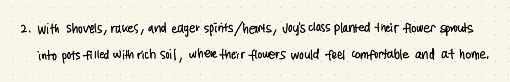
Option 1: This was my first draft for the illustration, but I thought that maybe a birds-eye perspective would better capture the busyness of the planting process that I envisioned when writing.
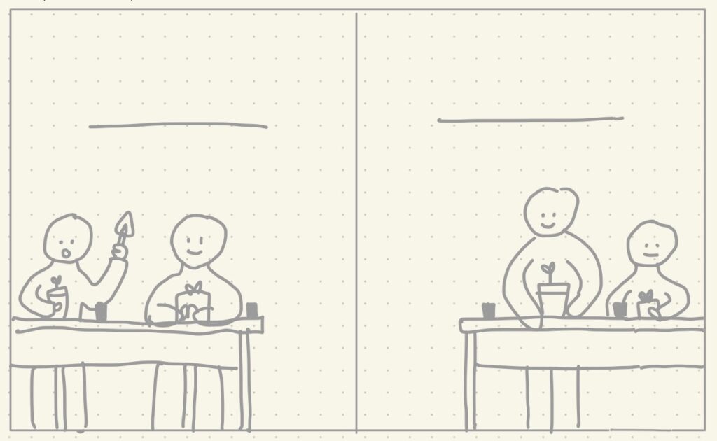
Option 2: I also thought it might be interesting if the desks in this classroom were different, so I wanted to try a layout where the whole spread was the desk in birds-eye view.
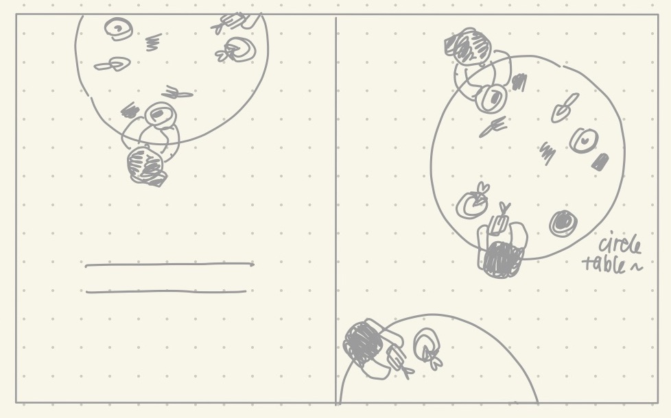
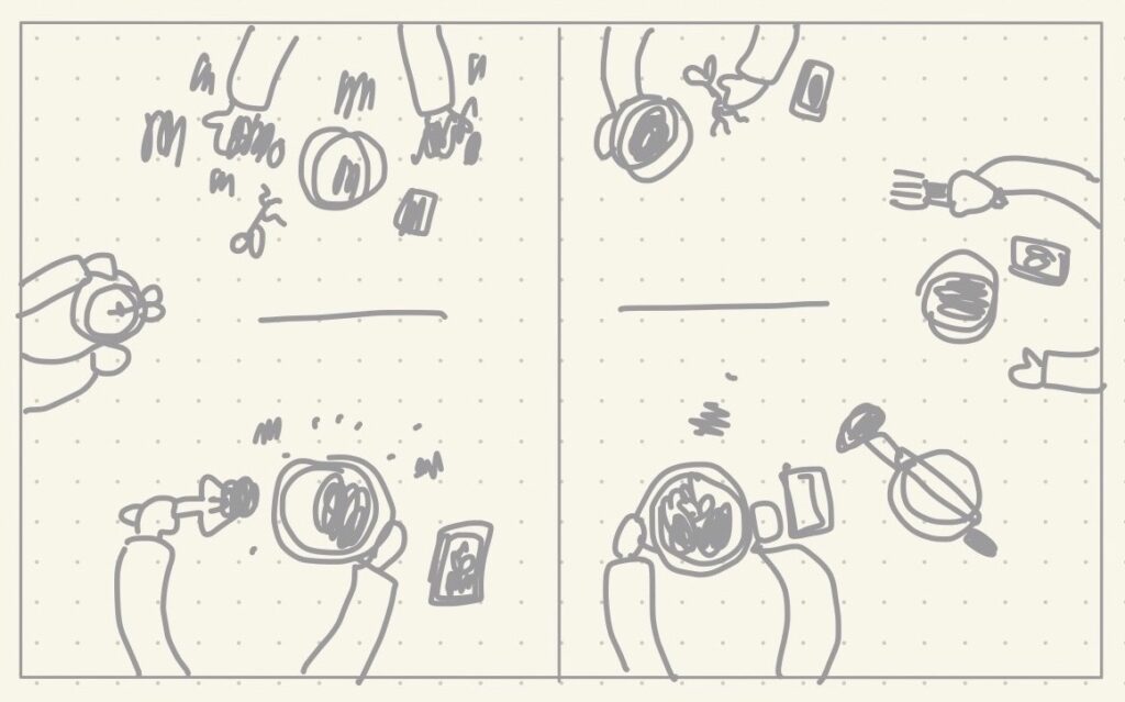
Option 3: Circle tables are another idea I had in mind for this spread, but since the spread can’t be circle shaped, there would be a few tables scattered around the spread.
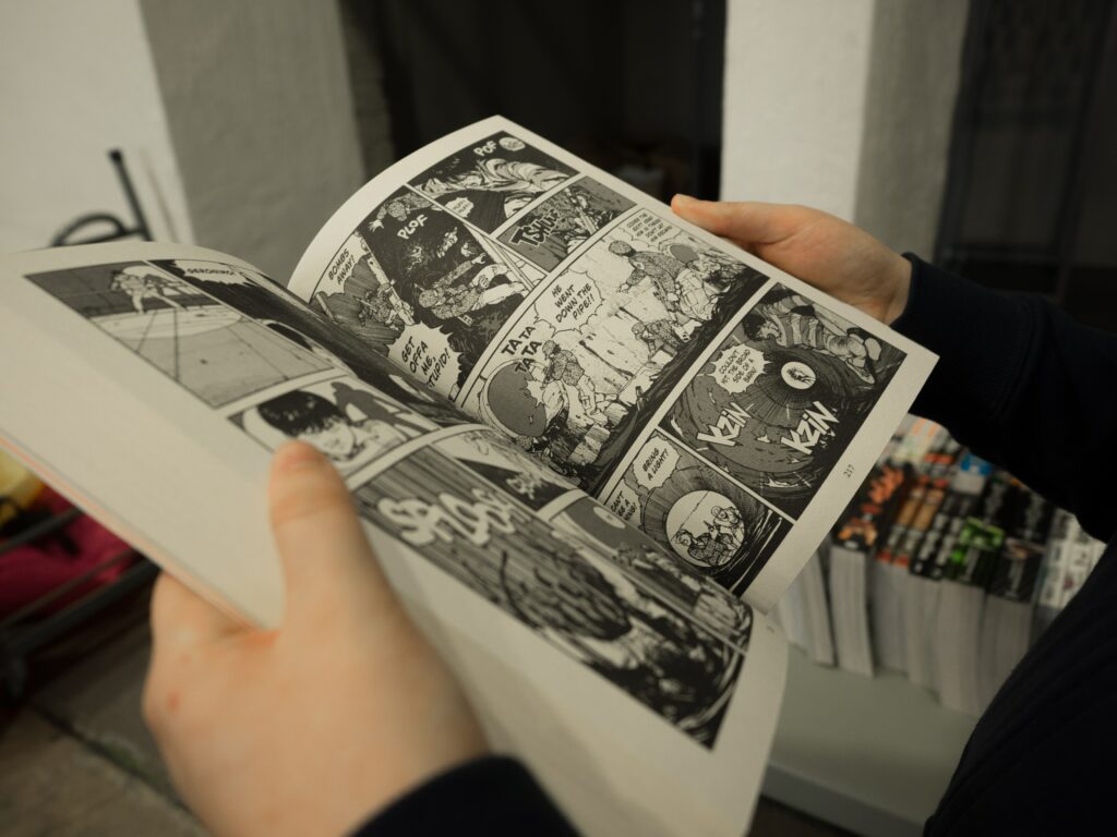
To move on from spread 2… While working out how I should format a page in spread 6, I was inspired by comic books! The way these books manipulate fonts, size, and colours of words (especially onomatopoeias), enhances its stories by illustrating sounds, movements, and even smells. Some of my favourite comics growing up were, Calvin and Hobbes by Bill Watterson and the Archie Comics.
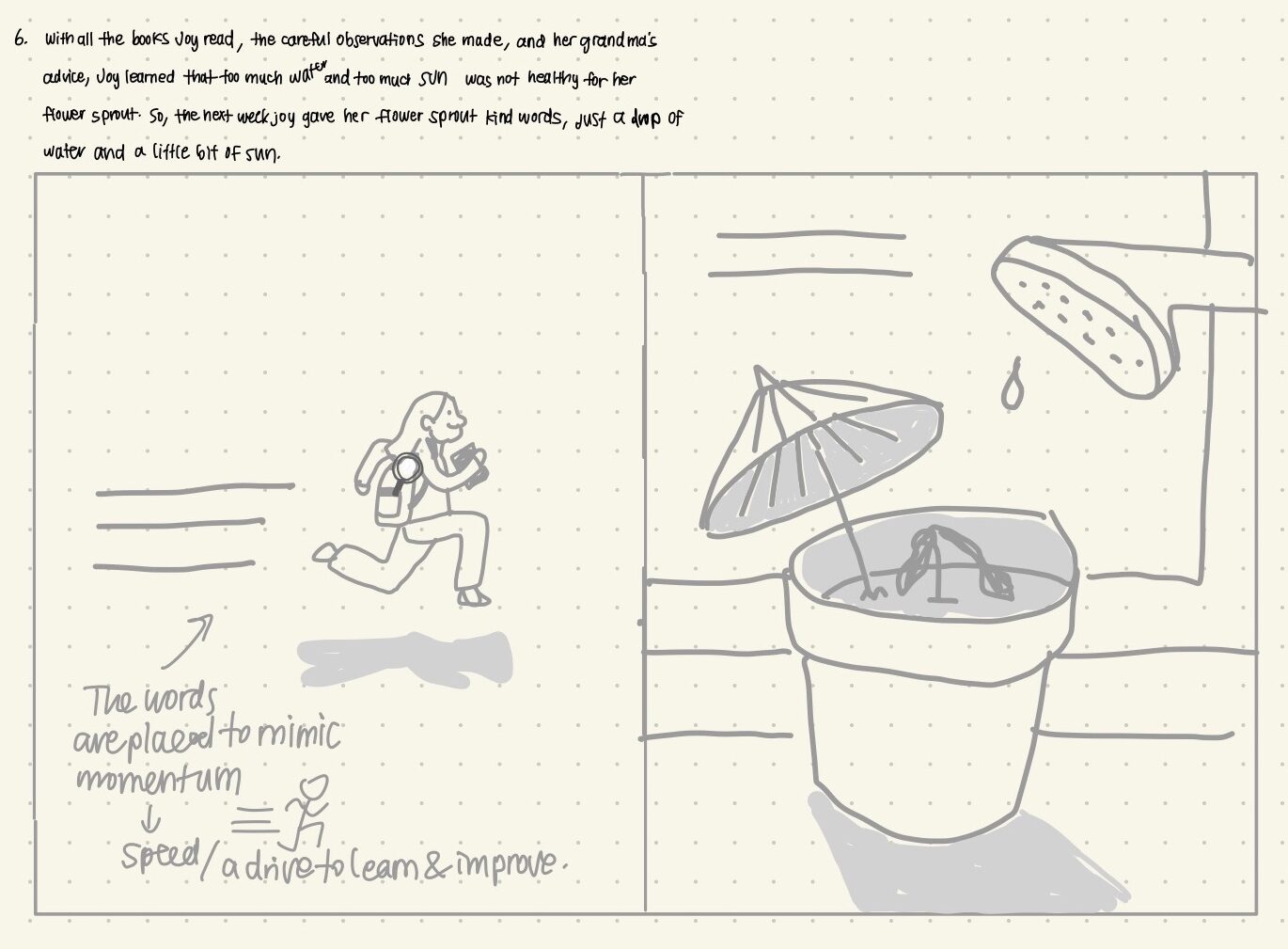
On the left page of spread 6, I’m going to try using the lines of writing to mimic momentum in my character’s run! I not only want to show a physical movement, but I also want to show the character’s mental and emotional drive to learn and apply her learning. In this case, my character is excited to use what new knowledge she’s gained in order to help her plant grow.
For next week, I still have four more spreads to work on! This portion of my picture book development process is taking longer than I thought, but it’ll be so much easier to complete the final illustrations with a solidifed storyboard that I’ve taken my time with. Stay tuned!
teaganhunt
Hi Yireh,
I am soooo stoked about your idea! In regards to your question, I think that option 2 is my favourite. I really like the birds eye view and also the hands-on-view of the creative working. Your drawings are AMAZING. I can never imagine being able to draw as well as you:/
I think the idea of physical, mental, and emotional movement is a great idea. I think that is something that can be super hard to communicate to readers, but you seem to have a good idea of how to do this.
novalong
I just have to say, the layout of this post is very satisfying. I like how you’ve done your drafts in gray to show they are a work in progress.
In terms of your question, I have to agree with Teagan. Option two makes the students seem a lot more like a community as they work together on planting their sprouts. Also, I love how you personified the sprouts in your writing draft by saying they would “feel comfortable and at home”. The language perfectly describes the sprouts happily, nestling into the fresh soil.
Happy drawing!
shonathompson
Hi Yireh!
I loved all of your options and design layouts! I personally really like option 3. It has a really strong triangle which takes your eyes around the page over and over, which is very engaging in my opinion. All three are great demonstrations of what you want to get across, though.
Your choice in format will turn out amazing I am sure! I love the idea of using words to demonstrate speed, especially in a kid’s book. I feel like it will help get your points across and place emphasis where you want and need it. You will definitely be able to feel the excitement with her words powering her forward.
hannaguiney
Hey Yireh,
After reading through your blog posts on your free – inquiry, I think that the second option of having the desks in a “birds eye view” is the best way to go. The reason I think this is because it shows the characters of the story all sitting together and working as a group, rather than independently working at their own desk. Group work is super important for socializing and I think this image would reinforce that idea well.