Hi readers! If you haven’t seen Nova’s Portfolio‘s post just yet, I’m excited to announce a collaboration. Nova and I are going to be sharing a table at the UVic Artisan Market on November 30th! Our plan is to sell stickers, possibly prints and I know Nova plans to display her canvas paintings as well. To give a little sneak peak, I’ll share a couple sticker designs in the making.
I want to make at least 3 more designs for large stickers and I’m also thinking of making a sticker sheet for teachers to use when marking! Remember those stickers that would say “good job!” and “excellent!” My goal is to spot a random nalgene bottle with one of my stickers on it sometime on campus after the fair. I’m so excited for the fair so stop by on November 30th at the SUB!
Picture Book UPDATE:
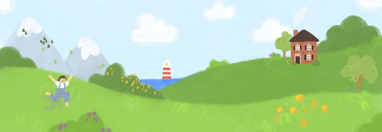
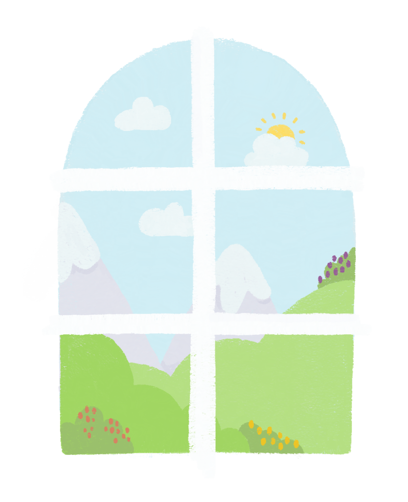
I’ve officially created an official official draft/outline for the first spread of the book! The colours are only for test so they’re not the final colours. I might keep some of the same colours though. Also, I have made the formal decision not to draw noses on my people because they just look so much more adorable without noses for some reason. Wouldn’t you agree?
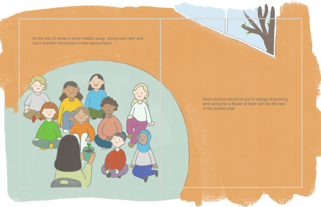
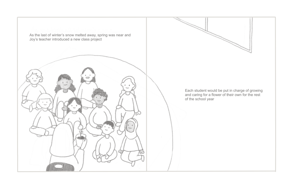
Another important aspect to picture books is the writing itself and how the writing is displayed. Font is something I still haven’t put too much thought into, but I’ve been dabbling around with a few options that I would like your opinions on to get a start on what direction I should go.
- Classic: I’m a sucker for the classic prints and fonts because of the posh aura that they give off. This may be controversial, but I actually really like Times New Roman.
- Handwritten: I would also love to handwrite the writing, but there’s the concern of consistency with that. However, I would love the organic look and it would feel extra personal.
- Standard: For standard, I think of fonts like Ariel and the sample one I have on my draft/outline spread above. These kinds are the most beneficial for legibility. Also, they don’t stand out, but rather blend in.
- Other: There are tons of other fonts out there so I’ll leave it open for you readers to put in some input and suggest any fonts you think might fit well with the story and illustrations.
carasartorio
OK first off your book is looking so good! Do you plan on publishing it when you are finished? I love the idea of handwriting the words, I agree it is personal and would look really nice in your book, however, if you do want it to be more consistent whatever font you have currently in your story looks great!