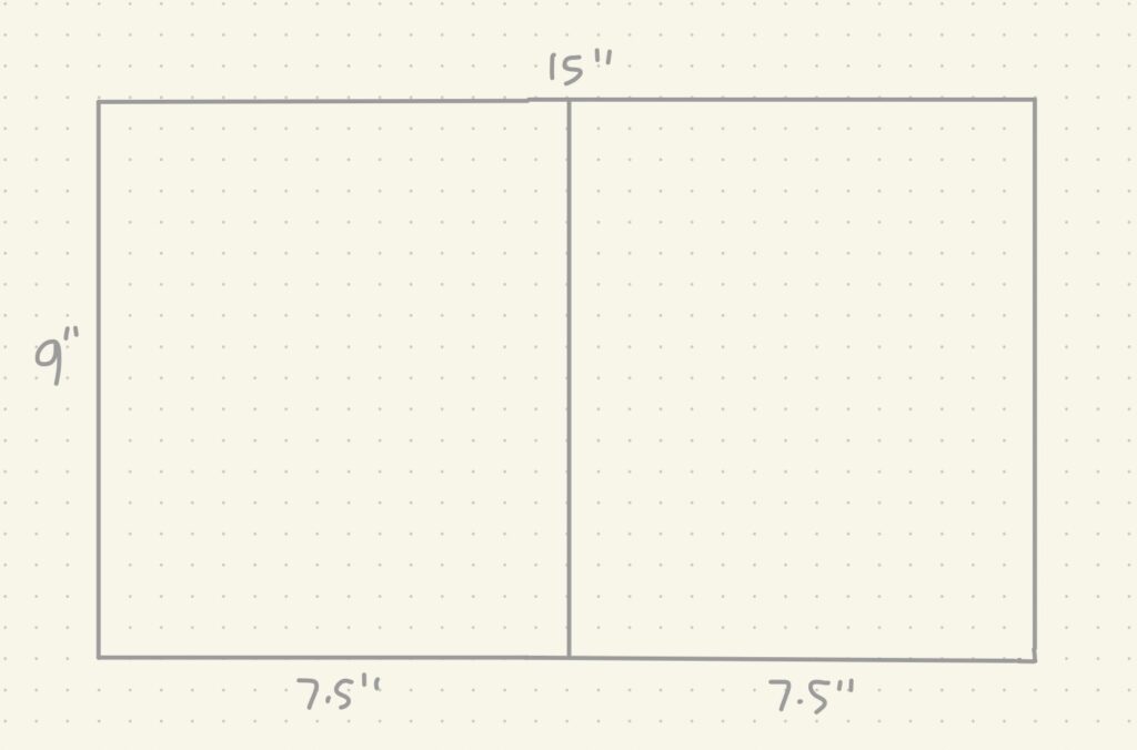

I decided to do some testing this week with colour, procreate brushes and printing! Last week, I determined the pixels, DPI, and dimensions I needed for a print on 11″ x 17 ” paper for the final book. I illustrated on those set numbers from last week and printed it out on a 8.5″ x 11″ paper because that’s all I had, but I’m hoping to do another test with 11″ x 17″ when I get the chance. The colours came out great and the quality was crisp. I’m hoping my numbers are correct so that it comes out clear on the larger paper too.
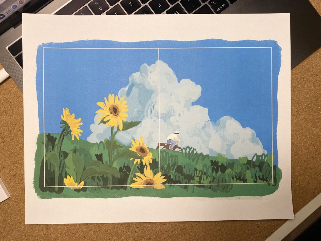
My test illustration is of a still shot from the movie My Neighbor Totoro from Hayao Miyazaki and Studio Ghibli, which is my laptop screensaver. I chose this because I really liked the colour palette of the original still and I wanted to see it printed. It turned out so perfect for what I envisioned the picture book to look like and feel like. I was dabbling between realism and a imaginitive with my illustration style and I think I’ve landed on an in between. I feel like total realism might take away from the readers’ opportunity to use their imagination. Also I think in general, drawing unrealistically is always so much more fun because you as the artist get to choose the bounds of reality!
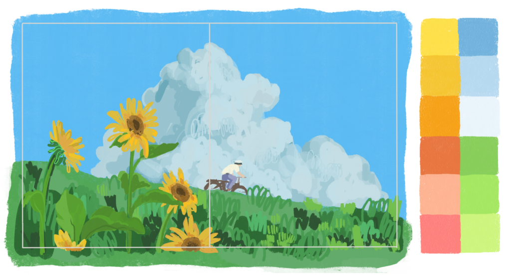
The colour palette below is set for the final illustrations and was inspired by the original still shot I drew and from all Studio Ghibli movies in general. I’ve grown up with these movies, which emit a certain warm energy through the stories and the beautiful animation. Other movies I was inspired by and will continue to use as a reference are, Ponyo, Castle in the Sky, and Howl’s Moving Castle.
What kind of mood does the colour palette that I chose give off to you?
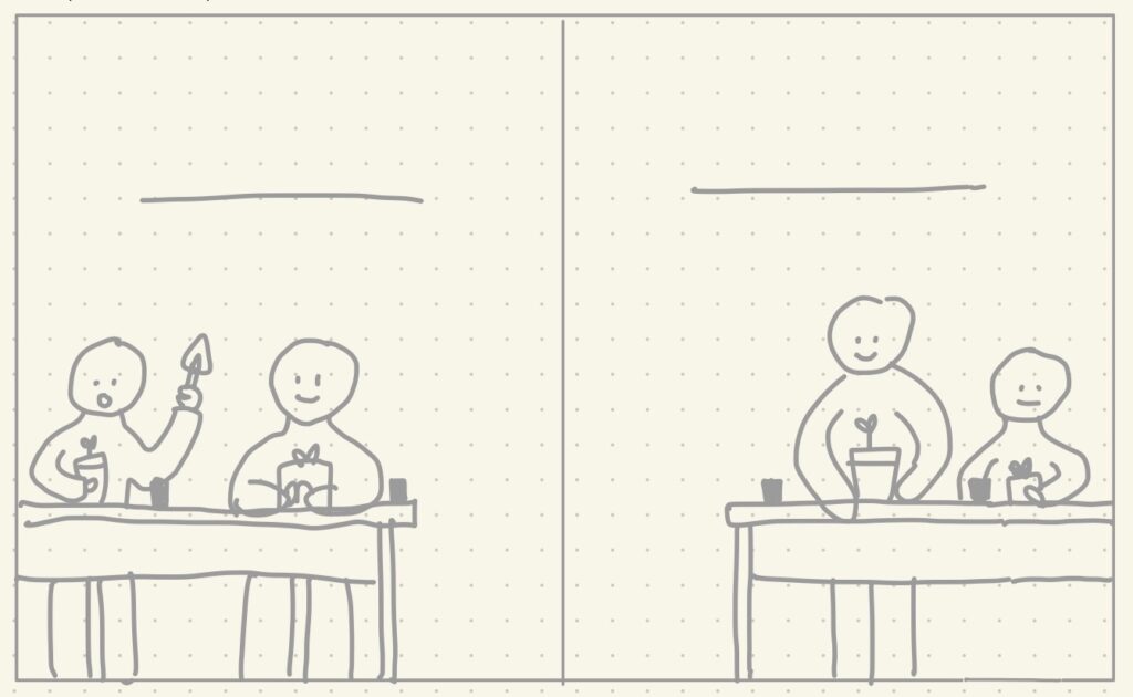
One thing you might notice about my illustration above, is that I have my spread outlined, but I’ve drawn over the outline. I learned to do this with my first picture book experience for a seamless look in the final book and also to create wiggle room for editing or adjustments. This is especially helpful when the illustrations are done traditionally on paper.
To go back to the talk on colour palette and illustration style, my goal is to create this book as engaging as possible and in that, colours and style make a big impact. When I think of the Fancy Nancy books by Jane O’Connor and Robin Preiss Glasser, I remember the glitz and glam of the illustration style and with Robert Munsch’s books, Michael Martchenko’s iconic style that perfectly illustrate the wildness of Munshch’s stories. I’m hoping to experiment and build my own, one of a kind, and iconic illustration style through this project.