Welcome to Yireh Park's Blog

Category: Free Inquiry Page 1 of 2

This is the category to apply to your Free Inquiry posts.

Flower Sprout

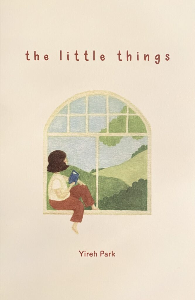
We’re already at the end of the term, which is wild and I’m so excited to share with you all the progress I’ve made on the picture book! I am titling the book Flower Sprout and have created a read-aloud video that you can find embedded below. Although my initial dream time-line did not totally pan out, I’ve completed a lot more than I thought I would. I was able to finish the final illustration outlines, the front cover and the back cover. I would love for you to watch the video or scroll through the pdf version and I hope you enjoy the book!

Final Reflection

Overall, I learned a lot and had a lot of fun with this inquiry project. Some of the challenges I faced was an overall lack of time and a feeling of pressure to finish. However, I learned to take my time with it in order for me to put in my best work. Also, my previous picture book project was a very personal book to me, so creating a book that catered towards younger elementary students came as a struggle. I wanted to make the story meaningful and fun but also relatable and engaging for that age group. With this, one thing I wish to have worked on more, is the story and writing. I hope to develop a certain distinct style of writing that students engage with as I did with some of my favourite authors such as, Shel Silverstein and Robert Munsch.

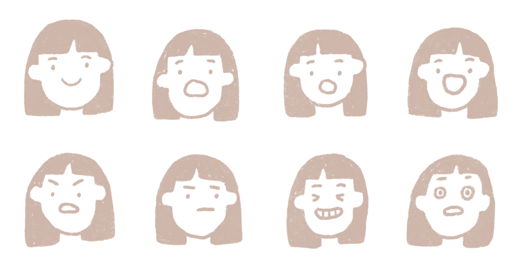
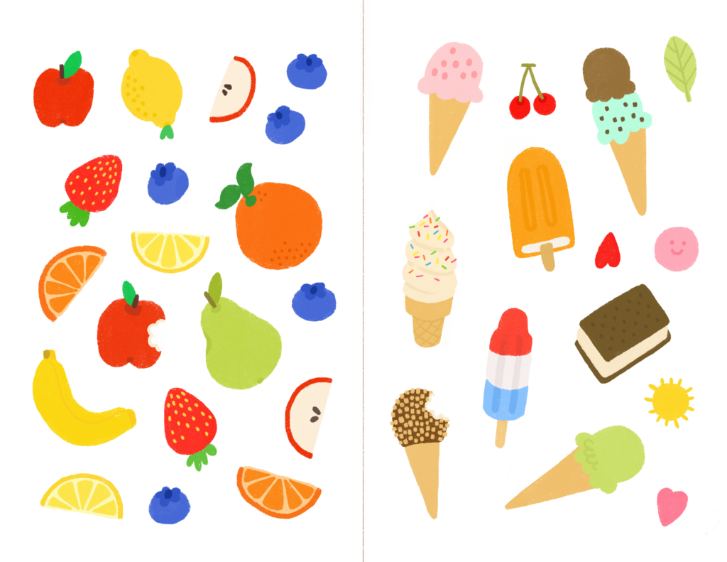
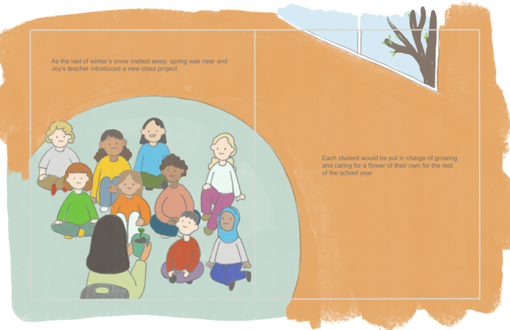
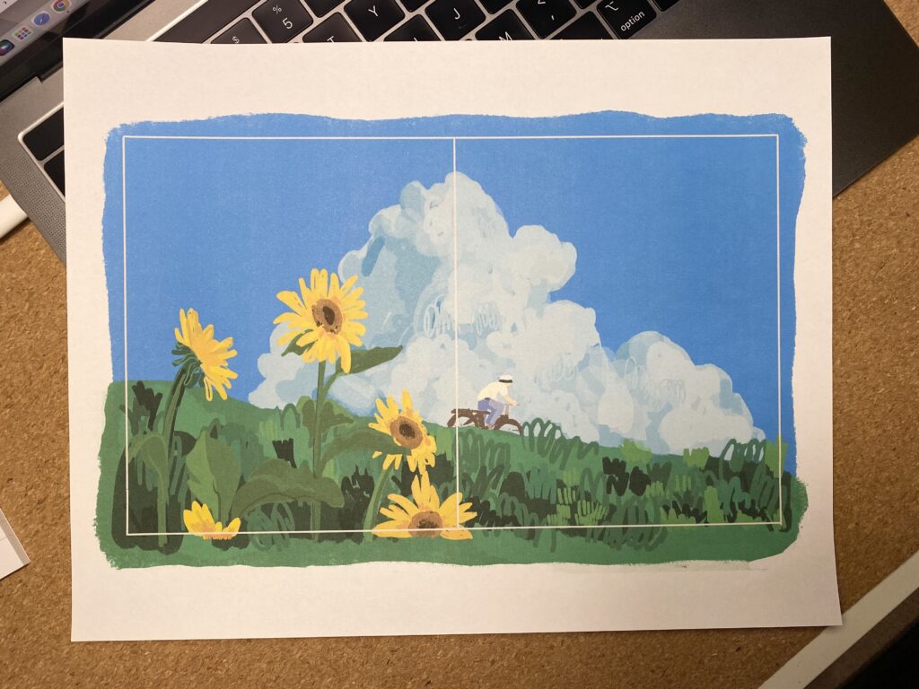
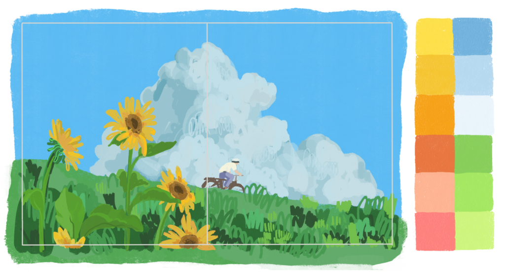
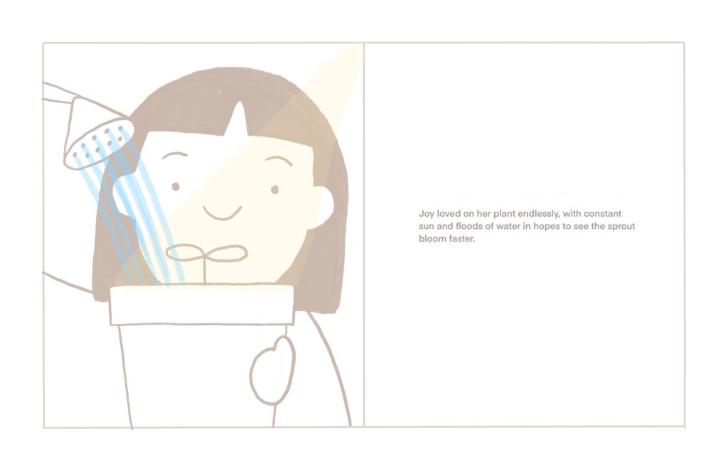
The illustrations took the most time and I’m really proud of how they turned out. I spent a lot of time going through different renditions of illustrations because I wanted to achieve consistency and create a symbiotic relationship between the writing and images being shown. I didn’t want the writing to seem like a caption to an image or for the illustrations to be taken as add on visuals to a writing piece. I think a key piece to a successful picturebook is having the writing and illustrations work as one

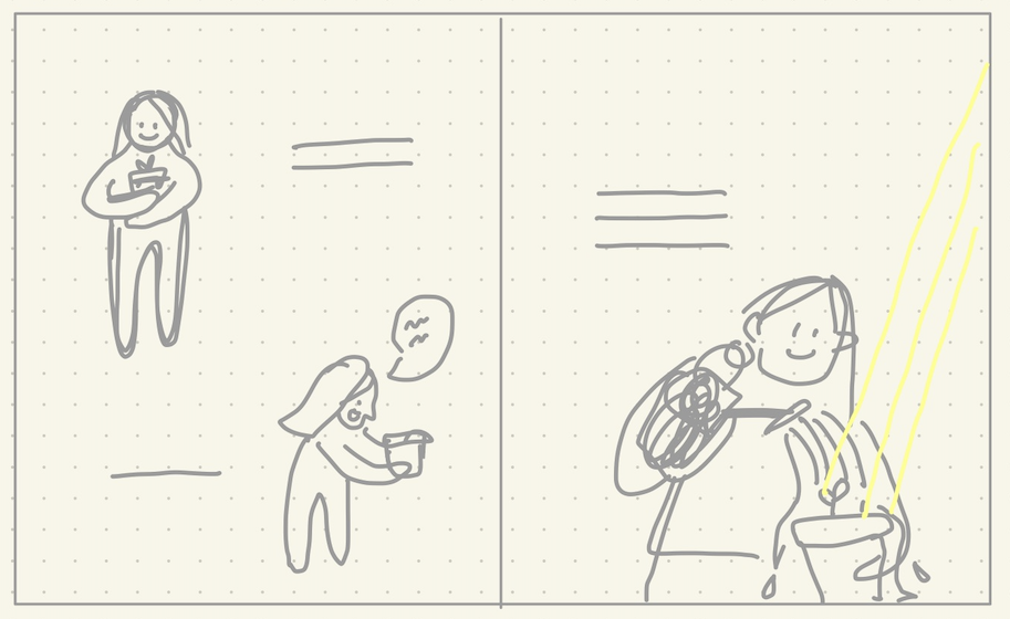
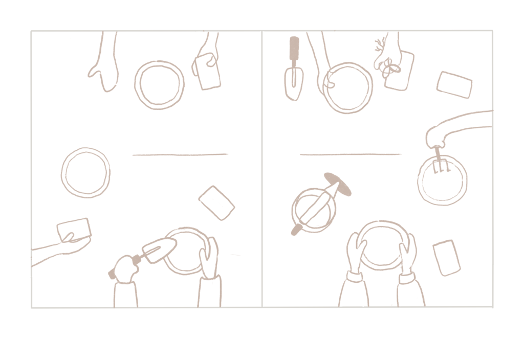
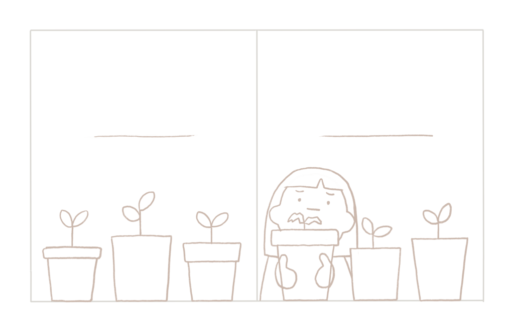
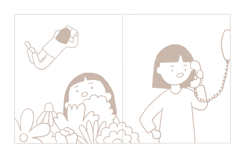
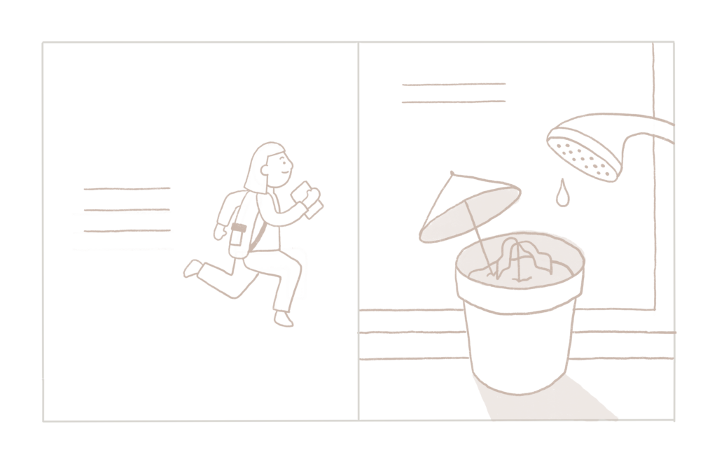
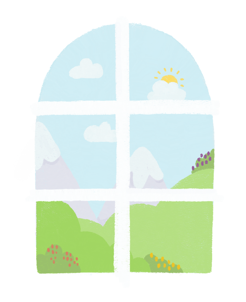
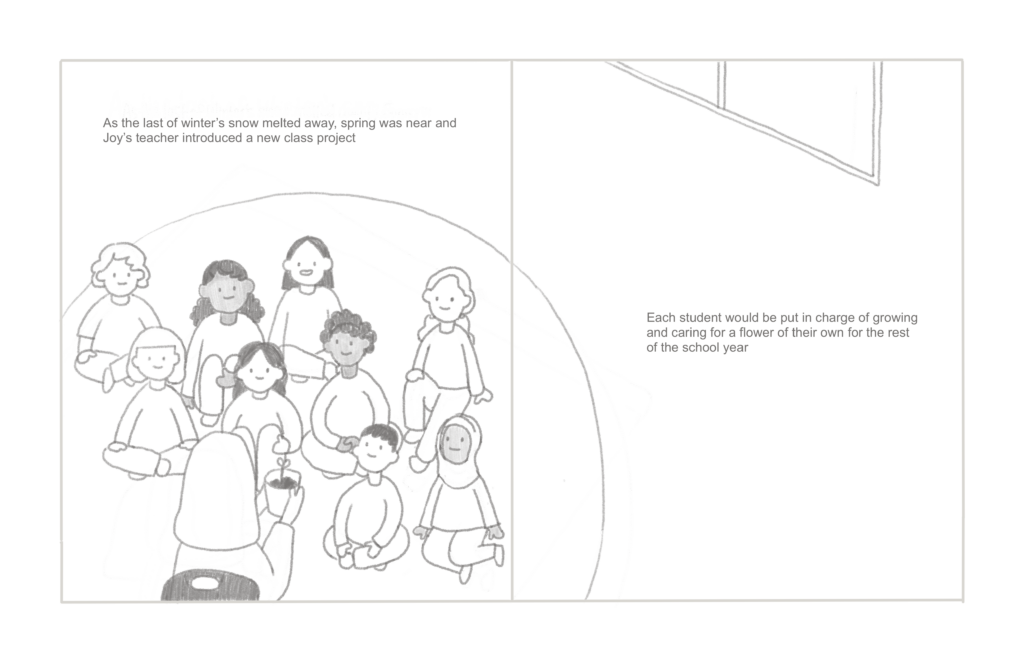
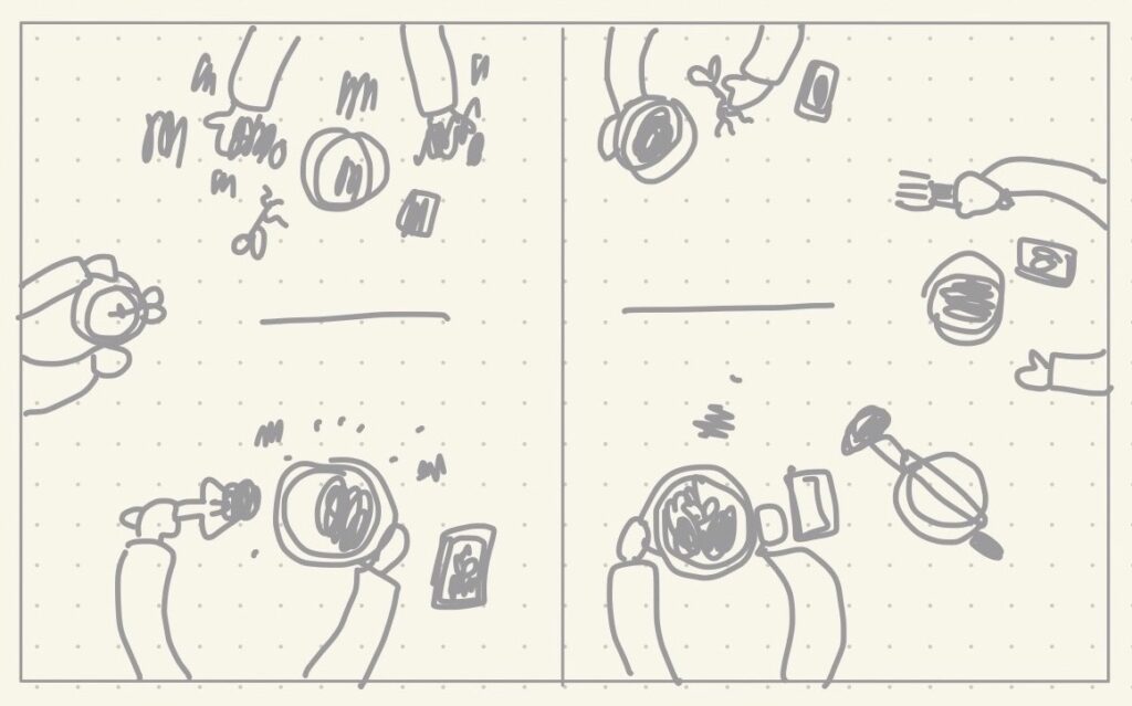
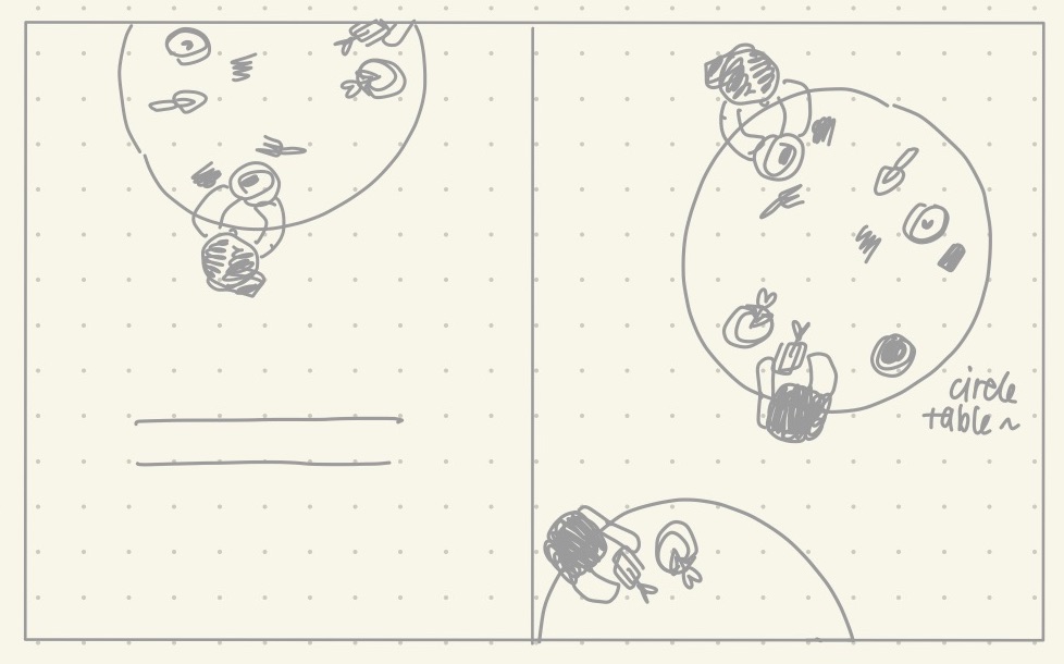
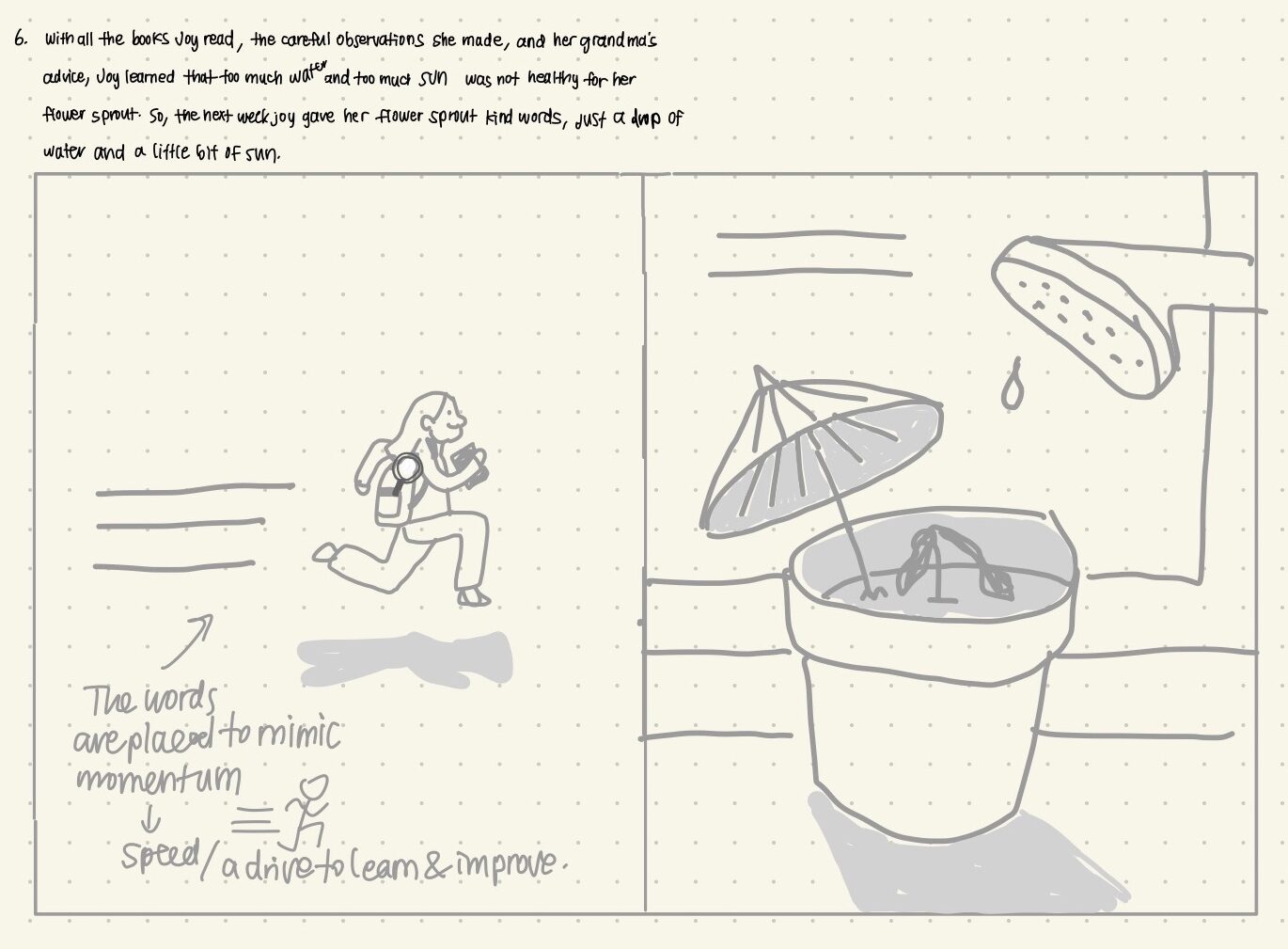
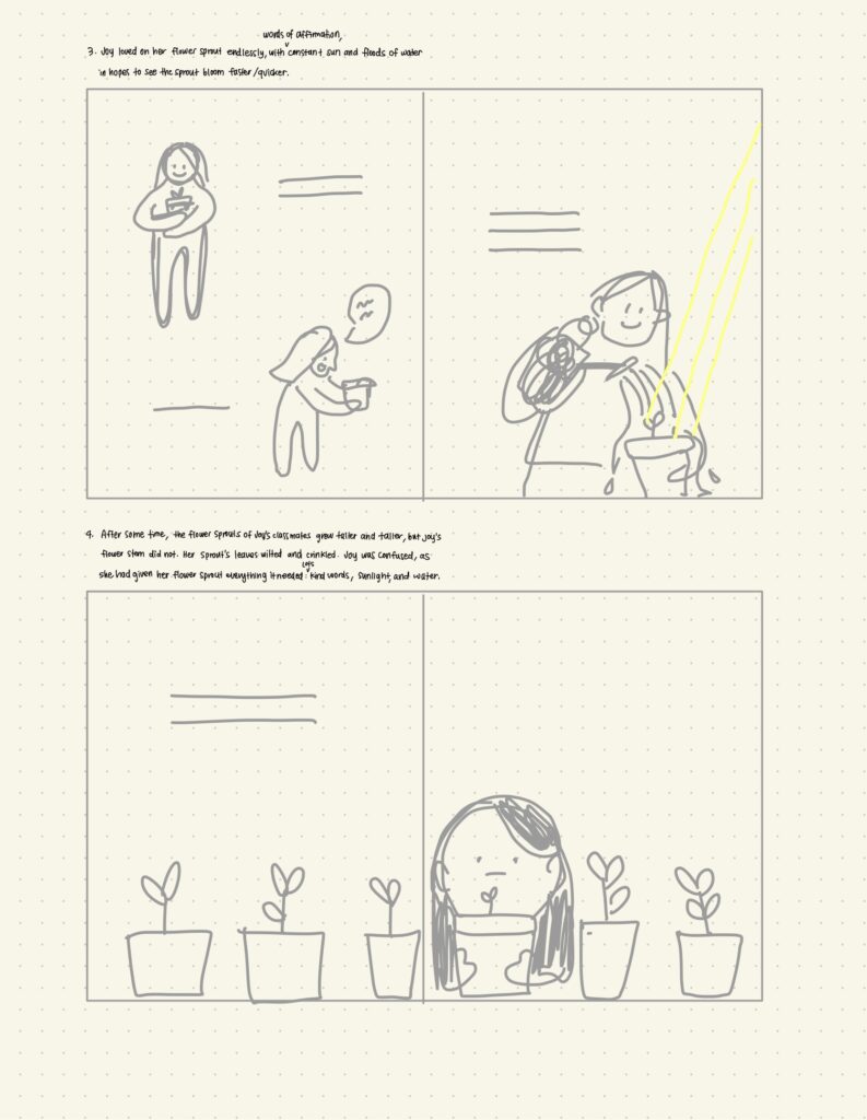
You can see in the images above that I totally changed the format of one of my spreads because I realized while doing the final outline that it really didn’t work with the writing and the composition was not pleasing to the eye. Going through a process like this opened my eyes to how much goes into making a simple picture book and how intentional you must for a good product to come out.

So, thank you readers for coming along on this journey with me and I’m glad I had this platform to share it with you all. Also, big shoutout to Procreate! The app was really essential to this whole project and I can see myself doing more picturebook project illustrations on Procreate. I would really recommend it! Stay tuned for the final final printed product with colours, a dedication, a bio and all! I’m going to be working on this at my own pace over winter break so come by and check my progress. Have a great holiday season and I hope you were able to take away a little something from my inquiry project and the picture book I created!

Joining BookTok

Photo by Josh Applegate on Unsplash

As a writer and illustrator of an upcoming bestselling picture book (haha), I have decided to join tiktok. Specifically, I’m joining the BookTok community. I thought this would be a fun idea to involve modern social media platforms in my free inquiry as I continue working on my illustrations. I created a tiktok interviewing my peers in Education about their favourite childhood picture books. It was curious to learn what books my peers grew up with and why they chose the books they did. This was so much fun to film and their answers brought back so many nostalgic book memories from when I was a wee young lad reading picture books at home and at school.

The picture book that holds a special place in my heart is The Giving Tree by Shel Silverstein. It’s quite a sad book in the end, but it’s one of the first books that envoked some critical thinking and analysis in little Yireh’s brain. I also love Shel Silverstein’s other poetry books like Where the Sidewalk Ends.

Out of the Books my peers talked about, Mr. Kellam’s choice of Garfield sparked a new idea in me. Perhaps my next project will be on creating a comic or graphic novel. As someone who is shamefully not a big novel reader, I absolutely love reading graphic novels. Some of my favourites are the Amulet series by Kazu Kibuishi, Cardboard by Doug TenNapel and Smile by Raina Telgemeier.

Features and Favourite Picture Books:

  • Nova Long: Pippen and Pudding by KV Johansen
  • Chris Kellam: Garfield by Jim Davies
  • Meaghan Leong: Love You Forever by Robert Munsch
  • Jo Huber: A Bad Case of Stripes by David Shannon
  • Jayda Konnila: The Paper Bag Princess by Robert Munsch
  • Teagan Hunt: The Very Hungry Caterpillar by Eric Carle

A big thank you to everyone who participated in the video!

In terms of my book progress, I am continuing to work on my illustrations and am striving to finish them by the end of the week if possible! There is a lot to do in the last weeks of the term so I’m quite honestly overwhelmed, but so far, this free inquiry experience has been really valuable and I’m looking forward to continuing to work on it after the term ends to finish it and post my final product! Maybe I’ll post more about it on tiktok too and build a bigger presence on BookTok.

Tackling Expression and Consistency

Hi readers! In my last free inquiry post, I introduced my old picture book, which was more of a concept based book, rather than a story. Because of this, there were two new challenges I had to face with the book that I am currently working on. First off, I’ve never had to draw one consistent character and secondly, I’ve never illustrated a character’s expressions for storytelling. As I continue to work on my final outlines, I find myself erasing and redrawing my characters’ facial expressions to get the right mood. The hair is hard to keep consistent within all the illustrations too. I constanly go back and forth between illustrations to make sure the hair is the same length and volume. I chose a pretty simple mushroom cut (inspired by my childhood haircut) in order to make it easier to draw the hair consistently.

The smallest changes in an eyebrow’s angle changes the character’s whole entire mood and expression. Eye placement and mouth placements also make big differences that are really noticeable. I had a lot of fun with the expression tests that I did in the image above.

My Progress: I’ve been able to work a lot more on the picture book so yay! The final outlines are getting done slow and steady, but I’m really liking how they look so far! Spread 3 wasn’t working out the way I had planned so I’m going to have to go revisit that one later.

I’ve now completed five spreads so I’ve got 7 left to go! With the pace I’m going at, I’m pretty sure I won’t be finished the book in its entirety by December 6th, but I’m hoping to have finished the final outlines and started working on the colouring. The dream goal would be to have the illustrations all complete by December 6th. I hope to continue working on the book through winter break to complete it!

Stickers Galore

This week, I went a little wild with my sticker designs and had a lot of fun doing it! There is a lot more than I had planned for now, but I’m really excited for all of them to come to life and for you all to see!

With some thought about the demand I might expect from buyers at the market, the big thing I thought of was nostalgia! We love our Y2K themed things nowadays so I thought I would profit on that a little bit by creating a CD sticker design and a goldfish or fishy cracker design. I also tried out an ipod, but that one didn’t end up looking all that great. I also added a couple new houses because I find it really fun to draw those. Another addition, is the submarine window with a deep sea view.

For those teachers out there, and by specific request from Meaghan Leong, I also made two stickers sheets. One with a variety of fruits and one with ice creams! I think these would be so cute to use for student work or crafts.

Although Nova Long and I have got our designs down, the issue now is how we will be making these designs into stickers. Our initial plan was to use a cricut, but with no prior experience with a cricut, this proved to be a lot more complicated and time consuming. Kudos to Nova for struggling through that in my stead. Now, our backup plan is to use a separate source, which we found online. Sticker App is a great company we found that has fair prices for custom sticker printing and if we order now, the stickers should be here at least 5 days before the market, which is pretty risky, but it seems like our best shot for now.

Picture Book Update: My reading break has been consumed by the stickers so I haven’t made any more progress on my picture book. However, being home, I now have a hold of the first picture book I made a couple years ago and I’ll be bringing it back to Victoria to use as inspiration and to share with you all.

The book description: “A collection of moments in life that are often taken for granted and forgotten in a world consumed by busyness and technology” What is a little thing in life that you often take for granted? Whether it be a moment, a certain smell, or feeling?

Here are some of my favourite spreads in the book:

Art Fair Collab +

Hi readers! If you haven’t seen Nova’s Portfolio‘s post just yet, I’m excited to announce a collaboration. Nova and I are going to be sharing a table at the UVic Artisan Market on November 30th! Our plan is to sell stickers, possibly prints and I know Nova plans to display her canvas paintings as well. To give a little sneak peak, I’ll share a couple sticker designs in the making.

I want to make at least 3 more designs for large stickers and I’m also thinking of making a sticker sheet for teachers to use when marking! Remember those stickers that would say “good job!” and “excellent!” My goal is to spot a random nalgene bottle with one of my stickers on it sometime on campus after the fair. I’m so excited for the fair so stop by on November 30th at the SUB!

Picture Book UPDATE:

I’ve officially created an official official draft/outline for the first spread of the book! The colours are only for test so they’re not the final colours. I might keep some of the same colours though. Also, I have made the formal decision not to draw noses on my people because they just look so much more adorable without noses for some reason. Wouldn’t you agree?

Another important aspect to picture books is the writing itself and how the writing is displayed. Font is something I still haven’t put too much thought into, but I’ve been dabbling around with a few options that I would like your opinions on to get a start on what direction I should go.

  1. Classic: I’m a sucker for the classic prints and fonts because of the posh aura that they give off. This may be controversial, but I actually really like Times New Roman.
  2. Handwritten: I would also love to handwrite the writing, but there’s the concern of consistency with that. However, I would love the organic look and it would feel extra personal.
  3. Standard: For standard, I think of fonts like Ariel and the sample one I have on my draft/outline spread above. These kinds are the most beneficial for legibility. Also, they don’t stand out, but rather blend in.
  4. Other: There are tons of other fonts out there so I’ll leave it open for you readers to put in some input and suggest any fonts you think might fit well with the story and illustrations.
Printed paper with illustration of man biking through sunflower trail under blue skies

Testing Testing 1, 2, 3

I decided to do some testing this week with colour, procreate brushes and printing! Last week, I determined the pixels, DPI, and dimensions I needed for a print on 11″ x 17 ” paper for the final book. I illustrated on those set numbers from last week and printed it out on a 8.5″ x 11″ paper because that’s all I had, but I’m hoping to do another test with 11″ x 17″ when I get the chance. The colours came out great and the quality was crisp. I’m hoping my numbers are correct so that it comes out clear on the larger paper too.

Printed test illustration on 8.5″ x 11″

My test illustration is of a still shot from the movie My Neighbor Totoro from Hayao Miyazaki and Studio Ghibli, which is my laptop screensaver. I chose this because I really liked the colour palette of the original still and I wanted to see it printed. It turned out so perfect for what I envisioned the picture book to look like and feel like. I was dabbling between realism and a imaginitive with my illustration style and I think I’ve landed on an in between. I feel like total realism might take away from the readers’ opportunity to use their imagination. Also I think in general, drawing unrealistically is always so much more fun because you as the artist get to choose the bounds of reality!

The colour palette below is set for the final illustrations and was inspired by the original still shot I drew and from all Studio Ghibli movies in general. I’ve grown up with these movies, which emit a certain warm energy through the stories and the beautiful animation. Other movies I was inspired by and will continue to use as a reference are, Ponyo, Castle in the Sky, and Howl’s Moving Castle.

What kind of mood does the colour palette that I chose give off to you?

One thing you might notice about my illustration above, is that I have my spread outlined, but I’ve drawn over the outline. I learned to do this with my first picture book experience for a seamless look in the final book and also to create wiggle room for editing or adjustments. This is especially helpful when the illustrations are done traditionally on paper.

To go back to the talk on colour palette and illustration style, my goal is to create this book as engaging as possible and in that, colours and style make a big impact. When I think of the Fancy Nancy books by Jane O’Connor and Robin Preiss Glasser, I remember the glitz and glam of the illustration style and with Robert Munsch’s books, Michael Martchenko’s iconic style that perfectly illustrate the wildness of Munshch’s stories. I’m hoping to experiment and build my own, one of a kind, and iconic illustration style through this project.

Setting the Foundation

Finally! My rough storyboard is finished and you can check it out in the video below! Feel free to pause and read through the story and enjoy the imovie background music. This has taken me a good 3 weeks, but I’m glad I took my time with it in order to start the good copies with a strong foundation. There is still room for improvement though, so give me any feedback or suggestions you have, to make the illustrations and writing better (especially the writing)!

P.S. Thanks for all the feedback on my last free inquiry post! The majority of readers chose option 2 for pages 3 & 4 on spread 2. Option 2 is now solidified for the final rough storyboard!

The next step to this picture book journey comes with… some more storyboarding. But but but, this time it’s for the real deal. The new offical storyboards are going to be my actual guide layers for the final illustrations on procreate. The current drafts I’ve made are more so rough guidelines. Also, the writing placements will be made more official (no more random lines). In order to start the more offical processes, I need to set a few important pieces of information straight.

1. Dimensions: I’ve already set rough dimensions for my spreads with the rough drafts, but I need to decide on specific dimensions for the final book so that I know what size paper I should print on and what paper size I should set on procreate. The dimensions I have solidifed are 15″W x 9″H for each spread and 7.5″W x 9″H for each page.

2. Pixels: Pixels are a digital image’s displayable units. My intention is to print the spreads on 11″ x 17″ paper for the final book so with some research on DocuCopies and Bardot Brush I found that the pixels needed for good results are 3300px x 5100px and for the best image resolution, I should choose 4400px x 6800px on procreate.

3. DPI: The DPI is also key for the printing process. It stands for dots per inch and determines dot density. I really don’t have much knowledge on DPI so I went to ProcreateFolio, where there is Porcreate’s official forum for discussion amongst Procreate users. There, I found that the majority suggested 300 DPI for printing on 11″ x 17″ paper. Apparently 500 DPI is ideal, but is too much for the app itself to handle and not all printers are capable of printing 500 DPI.

Bye Bye Creative Block

Last week I wrote about being stuck on repetetive illustrations, but I think I’ve finally gotten myself out of the rut. In fact, I need help narrowing down on an illustration for spread 2 in my picture book. (I want to say this sudden boost of creativity came from the fact that that I worked outside in the sun today, but I can’t say for sure.)

Spread 2’s Writing Draft

Out of the options below, comment which illustration you think best represents the writing above in a creative and engaging way?

Option 1: This was my first draft for the illustration, but I thought that maybe a birds-eye perspective would better capture the busyness of the planting process that I envisioned when writing.

Option 2: I also thought it might be interesting if the desks in this classroom were different, so I wanted to try a layout where the whole spread was the desk in birds-eye view.

Option 3: Circle tables are another idea I had in mind for this spread, but since the spread can’t be circle shaped, there would be a few tables scattered around the spread.

To move on from spread 2… While working out how I should format a page in spread 6, I was inspired by comic books! The way these books manipulate fonts, size, and colours of words (especially onomatopoeias), enhances its stories by illustrating sounds, movements, and even smells. Some of my favourite comics growing up were, Calvin and Hobbes by Bill Watterson and the Archie Comics.

On the left page of spread 6, I’m going to try using the lines of writing to mimic momentum in my character’s run! I not only want to show a physical movement, but I also want to show the character’s mental and emotional drive to learn and apply her learning. In this case, my character is excited to use what new knowledge she’s gained in order to help her plant grow.

Spread 6

For next week, I still have four more spreads to work on! This portion of my picture book development process is taking longer than I thought, but it’ll be so much easier to complete the final illustrations with a solidifed storyboard that I’ve taken my time with. Stay tuned!

Rough Storyboarding

I’m having a harder time storyboarding this picture book compared to the one I had worked on previously. The last one was a lot less story driven and more of a conceptual poetry picture book, but with the one I’m working on now, I need to illustrate a specific story and consider the younger student audience that may rely heavily on the illustrations to understand the book.

A literary tool I am using in my writing is repetition, which I found to be used in a lot of children’s books including, All Are Welcome by Alexandra Penfold and The Very Hungry Caterpillar by Eric Carle. However, I don’t want to be too repetitive with my illustrations. I’m hoping to use various angles and formatting to make the images exciting and engaging! I want to avoid redundancy for students.

My Progress: I’ve done some very very rough drawings to lay out a simple storyboard, but I haven’t completed all the pages yet. The spreads above are those that I’m pretty set on and confident in. I’m stuck on a number of pages due to the redundancy issue I want to avoid, but I’m continuing to work through it. However, as you can see, there is some repetition in the illustrations with the row of plants, but I thought for the story, it was an angle that worked best to show the plant growth consistently so I’ll be using that throughout the book.

Also, a key point I need to keep in mind as I begin my illustrations is the importance of representation in children’s books. The Day You Begin by Jacqueline Woodson and All Are Welcome by Alexandra Penfold are examples of books that directly discuss diversity in schools. Although my story isn’t directly exploring diversity, representation of all different kinds of people with different skin tones and abilities is incredibly important for students to observe as they grow up in order to feel seen and included.

Next week, I’ll continue to storyboard and tackle the issues I’m having with it. Hopefully I have a full rough storyboard by next week, but I’m not expecting to finalize images to start official illustrating just yet!

Images illustrated by Yireh Park

Story Building & Writing Drafts

As I mentioned in my last free inquiry post, the picture book, The Name Jar was a big reason for why I chose to do this picture book project. Throughout my time in elementary school and high school, I never encountered The Name Jar, by Yangsook Choi, but I really wish I had. The story follows a young girl from South Korea who is deciding on a new name for her new life in North America. Ultimately she chooses to keep her Korean name, Unhei. It’s a meaningful story that I and many others can relate to or learn from.

I did a lot of story brainstorming and came to a relatively simple story about learning. I want to include the ideas of learning from mistakes, learning in a variety of ways, and overall send the message that learning is a challenge, but a fun one that can take time and effort.

My Progress: Above, I have my writing drafts for 12 spreads! I struggled with how to end the story and I did figure something out, but I’m still not sure if it’s the right way to end it. All of it is really rough and I haven’t gotten anyone else to give me feedback yet so I’ll most likely change a lot of things around during the illustration process, and until the end. Below, I have more illustration experimenting, which is also my website’s main home image.

Photo illustrated by Yireh Park

This coming week, my plan is to continue experimenting and to start working on storyboarding the illustrations on my iPad, which is the exciting part for me!

Page 1 of 2

Powered by WordPress & Theme by Anders Norén